
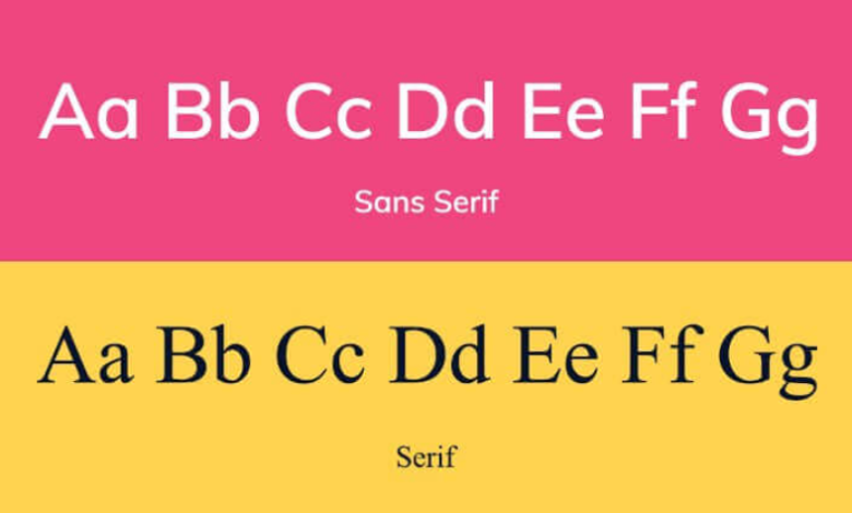
Among the many font styles, sans serif fonts are widely used due to their clean, modern, and versatile design. Unlike serif fonts, sans serif fonts do not have small strokes at the ends of letters, giving them a minimalistic and contemporary appearance. While they are highly effective in creating memorable brands, their improper use can weaken visual identity. Understanding the do’s and don’ts of using sans serif fonts in branding ensures that your messaging is clear, professional, and visually appealing.
The Do’s of Using Sans Serif Fonts
Do Choose Fonts That Reflect Brand Personality
Sans serif fonts come in a variety of weights, widths, and styles, each conveying a unique personality. For instance, a geometric sans serif like Helvetica communicates modernity and professionalism, while a rounded sans serif feels approachable and friendly. Matching the font to your brand personality ensures that typography aligns with the message you want to convey.
See also: Precision Matters: Tuning the Tech That Watches the Road for You
Do Prioritize Readability
Readability is essential in branding. Sans serif fonts are often easier to read on screens, making them ideal for websites, apps, and digital advertisements. Ensure that your chosen font is legible in different sizes and across various mediums, from business cards to large banners.
Do Maintain Consistency Across Platforms
Consistency builds recognition and trust. Use the same sans serif font or a well-paired combination throughout all branding materials, including social media, websites, packaging, and printed collateral. This cohesion strengthens brand identity and helps audiences instantly associate the font with your brand.
Do Pair Sans Serif Fonts with Complementary Fonts
While sans serif fonts work well on their own, pairing them with other typefaces can create visual hierarchy and interest. For example, pairing a clean sans serif headline with a classic serif body font can balance modernity with tradition. Experimenting with combinations should always serve clarity and brand coherence.
Do Test Fonts in Context
Always test sans serif fonts in real-world scenarios before finalizing branding. Consider different backgrounds, sizes, and digital or print contexts. Testing ensures that the font maintains its readability and visual impact under various conditions.
The Don’ts of Using Sans Serif Fonts
Don’t Overuse Decorative Styles
Some sans serif fonts include decorative or experimental elements, like exaggerated curves or unusual spacing. Using such fonts excessively can confuse audiences and distract from the core message. Reserve these fonts for emphasis, not the primary brand font.
Don’t Ignore Hierarchy and Spacing
Even a clean sans serif font can appear chaotic if used without proper hierarchy and spacing. Pay attention to letter spacing (kerning) and line height (leading) to create a professional, easy-to-read layout. Poor spacing can make your branding look amateurish.
Don’t Mix Too Many Fonts
Mixing multiple sans serif fonts in one project can create visual confusion. Stick to one primary font and one secondary font, if needed, to maintain clarity. Overloading a brand with too many styles dilutes recognition and weakens brand consistency.
Don’t Neglect Accessibility
Sans serif fonts are generally readable, but not all variations are accessible. Avoid ultra-thin or overly condensed styles that may strain the eyes, especially for users with visual impairments. Accessible font choices ensure inclusivity in branding.
Don’t Forget the Brand’s Mediums
A sans serif font that looks great on a website may not perform as well in print. Always evaluate fonts for every medium your brand will appear on, ensuring consistent legibility and visual appeal across platforms.
Conclusion
Sans serif fonts are a versatile and powerful tool in branding, offering clarity, modernity, and professionalism. By following the do’s—matching fonts to brand personality, prioritizing readability, maintaining consistency, pairing thoughtfully, and testing in context—brands can create a strong and cohesive visual identity. Equally important are the don’ts: avoiding overuse of decorative styles, respecting hierarchy and spacing, limiting font combinations, ensuring accessibility, and considering different mediums. When used strategically, sans serif fonts enhance recognition, communicate the right message, and elevate the overall branding experience.